Does your homepage say what you do in five seconds?
If a stranger cannot tell what you sell after a short look at your homepage, most of your visitors cannot either.

- A clear homepage answers four questions at first glance: what you do, who it is for, where or how you work, and what to do next.
- Research on page visits shows the first 10 seconds decide whether many visitors stay or leave.
- You can test your own homepage with five people, a screenshot and three questions in under an hour.
- Five seconds is a test setting, not a law: busy pages may need ten seconds, and the test cannot fix the wrong traffic.
A clear homepage tells a new visitor, at first glance, what you do, who it is for, where or how you work, and what to do next. The quickest way to check yours is a five-second test: show the top of the page to someone who does not know your business, hide it, and ask what they remember.
The test has limits. It measures first understanding, not whether the right people reach your site or whether your offer is competitive. For a service business, the commercial question is simpler: are people who could become customers leaving before they understand that you can help them?
How long do visitors give a homepage?
Not long. Nielsen Norman Group summarised Microsoft Research data covering more than 2 billion page visits in 2011. The finding: visitors are most likely to leave in the first 10 seconds, and pages that hold attention past about 30 seconds have a fair chance of keeping it for minutes. Nielsen's advice was to communicate the value proposition within 10 seconds.
A second, often quoted study is narrower than it sounds. Nature reported in 2006 that Gitte Lindgaard's team found people judge a page's visual appeal within 50 milliseconds. That study measured how attractive a page looked, not whether people understood it. Looks earn a few seconds. Words have to do the rest.
What a visitor needs to understand first
Four answers belong in the first screen, on mobile and on desktop. If any is missing, the visitor has to scroll, click or guess, and many will not.
Question | Weak answer | Clear answer |
|---|---|---|
What do you do? | "Solutions that work for you" | "Boiler repair and servicing" |
Who is it for? | "For everyone" | "For homes and landlords" |
Where or how? | Not shown | "Across south Dublin, same-day callouts" |
What next? | "Learn more" | "Call now" or "Book a visit" |
These examples are hypothetical. The pattern holds for most service businesses: a plain description beats a slogan, and a specific next step beats a vague one.
How to run a five-second test on your own homepage
You do not need a research budget. You need five people who do not know your business, a screenshot and about an hour.
A do-it-yourself five-second test
- Take two screenshotsCapture only what shows before scrolling, once on a phone and once on a laptop. Include any cookie banner or pop-up, because your visitors see it too. Allow 5 minutes.
- Find five people outside the businessFriends, neighbours or customers of other businesses are fine. Avoid staff and family who already know what you do. Allow 15 minutes to arrange.
- Show each screenshot brieflyShow it for five seconds, then hide it. If your page is busy, try ten seconds as well, since research on the method found complex pages need longer.
- Ask three questionsWhat does this business do? Who is it for? What would you click first? Write down their exact words. Allow 2 minutes per person.
- Score the answersCount how many people got each of the four answers right. Anything below four out of five points to the part of the page to fix first. Allow 10 minutes.
- Fix one thing and test againChange the headline or the main button, not everything at once, then repeat with new people so you know what helped.
A worked example: one homepage, before and after
Consider a hypothetical plumbing business in Dublin. This is an illustration, not a client result.
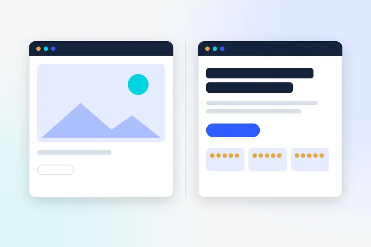
Before. The first screen shows a large photo of a modern bathroom, the headline "Quality you can trust since 2005", and a button that says "Learn more". The phone number sits in small text in the footer.
In a five-second test, most people would likely guess "bathrooms" or "interior design". Few would know the business handles emergency repairs, and nobody would see the phone number.
After.
- Headline: "Emergency plumbing and boiler repair in south Dublin".
- Line under it: "Same-day callouts for homes and landlords. Fixed callout fee, quoted before we start."
- Main button: "Call now", with the number visible and tappable on mobile.
- Proof: three short customer reviews directly below the button.
Nothing about the business changed. The page now answers all four questions before the visitor scrolls.
Common reasons homepages fail the test
- Slogan headlines: "Excellence in every detail" could describe any business. Lead with the service, and keep the slogan for later.
- Every service at once: listing eight services in the first screen means none of them registers. Lead with the one most visitors come for.
- The image takes the space: a large photo pushes the words and the button below the fold, especially on phones.
- Something covers the page: a cookie banner, chat bubble or newsletter pop-up can hide the headline in the first seconds.
- A vague button: "Learn more" and "Discover" give no reason to click. Name the action the visitor wants to take.
Our website UX audit guide covers how to check the rest of the visitor's journey once the first screen passes.
What the test cannot tell you
The five-second test is a quick check, not proof. A Smashing Magazine case study from December 2023 argues the five-second figure rests mostly on practitioner habit. Its experiment found that understanding a site's purpose improved at ten seconds, and that visual complexity and people's working memory changed the results.
So treat the test as a way to spot confusion, not a score to chase. It also cannot tell you whether the right people are arriving. If your homepage passes and enquiries are still low, the problem may be traffic quality, the offer or how leads are handled. Our diagnosis for website traffic with no enquiries walks through those causes, and our introduction to conversion rate optimisation shows how to test fixes properly once you have enough traffic.
Before you change anything else on your site, check that a stranger can say what you do, who it is for, where you work and what to click, from the first screen alone.

Sima Damar Beygu
Founder of ConversionNest. 10+ years in growth marketing, managing 300K euro monthly media budgets and scaling acquisition across 15+ markets. MSc in Digital Marketing from University College Dublin. Google and Meta certified.
Sima on LinkedIn
What is conversion rate optimisation, and where should you start?
A worked CRO example takes you from a conversion-rate calculation to a test brief, with practical checks for measurement, customer evidence and commercial value.

Website UX audit: what to check before a redesign
A UX audit should follow important visitor tasks across the website. Use reproducible findings to decide which problems deserve a fix, research or a test.

Website Traffic but No Enquiries? A Practical Diagnosis for Service Businesses
Learn how to diagnose a website that attracts visitors but generates few enquiries, from traffic quality and form tracking to lead handling and commercial outcomes.